


Amazon Fire TV 2.0
SOLUTION
The Amazon Fire TV 2.0 redesign includes changes to the remote control and GUI that removes complex flow and allows users too get to their entertainment faster, and more easily. The control takes inspiration from existing 2 ft. UI controls to make interaction with TV more user friendly. The new remote uses a digital track-pad to reduce the number of buttons needed on the remote and gives it a cleaner look.
Please Note: This concept was developed before the release of the new Apple TV Remote (2018).
CHALLENGE
The main focus of smart TV plugins is to allow users to quickly access their entertainment (video, music, etc.) Today, with an overload of apps, options and complex UI flow, the main purpose of the system is lost. Further, not much progress has been made in designing controls for these 10 ft. UIs and we still stick to the age old idea of a D-Pad control which limits in both control & state designs.
There is a need to rethink interaction with 10 ft. interface that is as comfortable and intuitive as a 2 ft. UI.

CURRENT GUI & CONTROLS
Like most 10ft. UI, the Remote control uses a D-Pad that is best suited to navigate through a grid layout.
The fire TV’s GUI, however, uses master menus (visually separated from the grid) & carousel rows (with hidden options off-screen) commonly found in desktop & touchscreen apps.
CURRENT STATE DESIGN
The top ring represents the master menu. The main focus of the menu are: Finding, Editing & Viewing apps.
The remote also has 3 dedicated triggers that allow users to bypass or edit certain states.
Pain Points
Based on the interaction flow analysis, user observations & state diagram analysis, the following pain points were observed.

IDEATION
I started my ideation by looking at the most commonly performed actions and redesigned the controls for the same to make the interaction faster, cleaner and more natural.

CHANGES to Design

Fire TV 2.0
This redesign of an already successful entertainment streaming device includes changes to the remote control and GUI to remove complex flows & interactions to create a more intuitive interaction that allows users to access their entertainment quickly & easily.


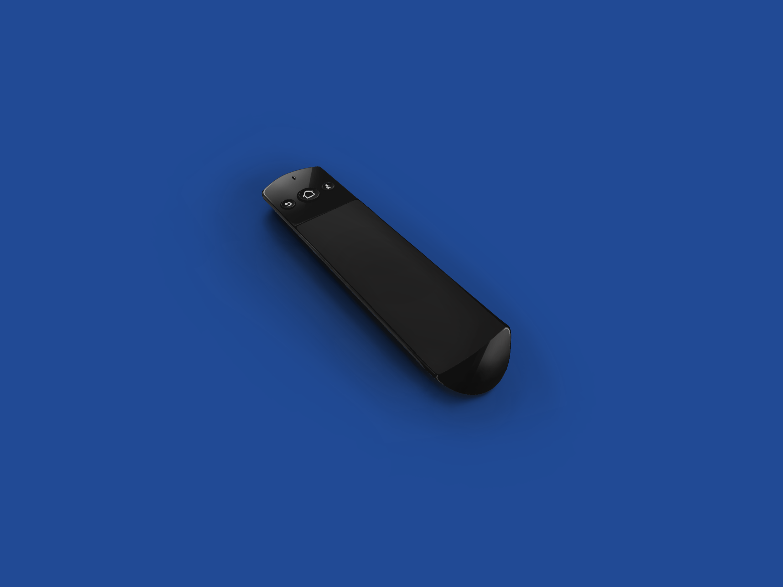
REMOTE 2.0
This new remote retains the same shape as the previous one but is 5mm wider.
Power & volume control buttons are added on either side of the device (as you would find on a smartphone) so that users do not need to switch between remotes
All the missing controls from the previous remote are combined in the digital trackpad an are displayed as and when needed.


Changing the orientation of the remote (horizontal) brings up a digital keyboard on the screen.
This replaces the tedious D-pad text input in the previous UI.
Graphic User Interface (GUI) 2.0
The new GUI gets rid of the master menu at the top of the screen. The app store & settings are moved into ‘My Apps’ & the search control is combined with Alexa Voice input.

The GUI is divided into 3 major modes:

Amazon Menu Mode
The banner is replaced by a single ‘Last Viewed‘ tab that takes the user back to where they left off.
The carousel interaction is replaced by a 5 column grid with all the apps on the home page. The trackpad can be used to either scroll or click (digital D-pad) through the grid.

Search (Alexa) Mode
Alexa is now the primary search input method for fire TV. The feedback for recording is also updated so that it is understood clearly.
If Alexa does not work, the user can change the orientation of the remote to type a search using the digital keyboard.

Options Mode
The option Mode is activated by double taping select on the trackpad and using the D-pad to scroll through.
The option menu also has a shortcut for settings incase the user neds to change a setting while in the middle of something.
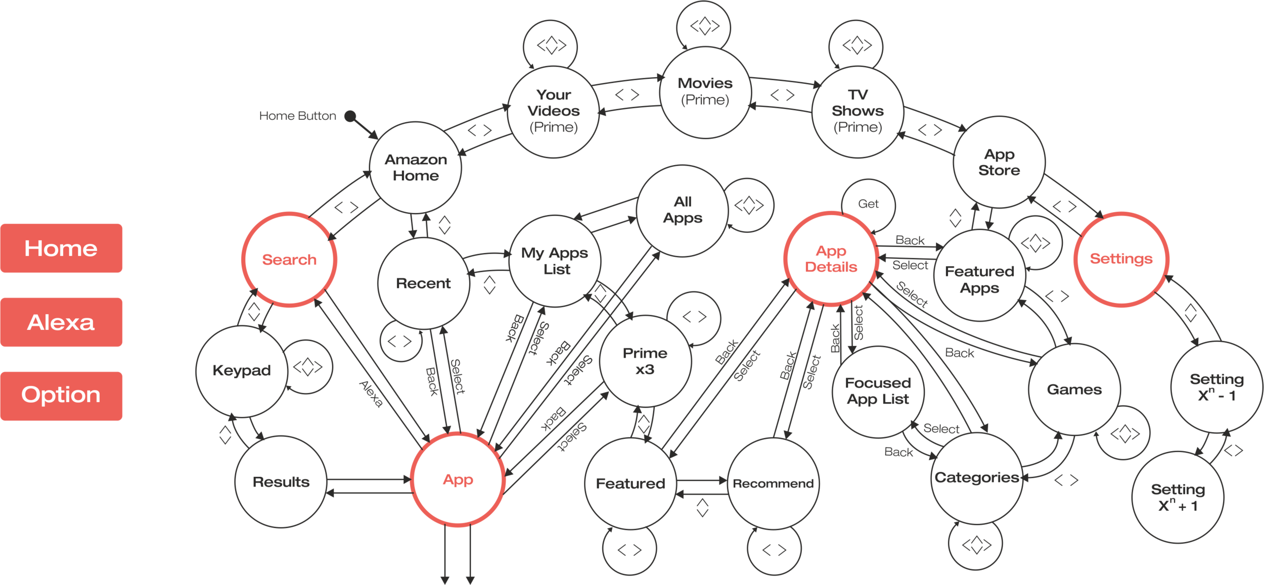
New State Diagram
The area in blue represents the default amazon menu state that has been reorganized so that the user can follow the flow of states.

Takeaways
There’s always a better way, and chances are that someone else has already thought of it before you. But that’s not necessarily a bad thing.
The goal is to help the user reach where they want to go. Everything else is secondary.
Understand the reason why the current situation exists, helps to create a better future.